Theme · 2010–2023 · 18 editions
International cities & countries
This collection gathers Absolut bottles dedicated to cities and countries outside the United States, each one a portrait of a place. Most pair a place with an artist who comes from it, so the bottle reads as a local view rather than a postcard: Jamie Hewlett drawing London figures from two centuries of style, or Oskar Metsavaht photographing Ipanema for Rio, the first Absolut limited edition for a Latin American country. Some came with a flavour of their own, made to taste of the place. Others look closer to home, at the Swedish character and at Åhus, the distillery town where Absolut is made.
-
Edition 1 of 18
Vancouver
2010 · 1 variant
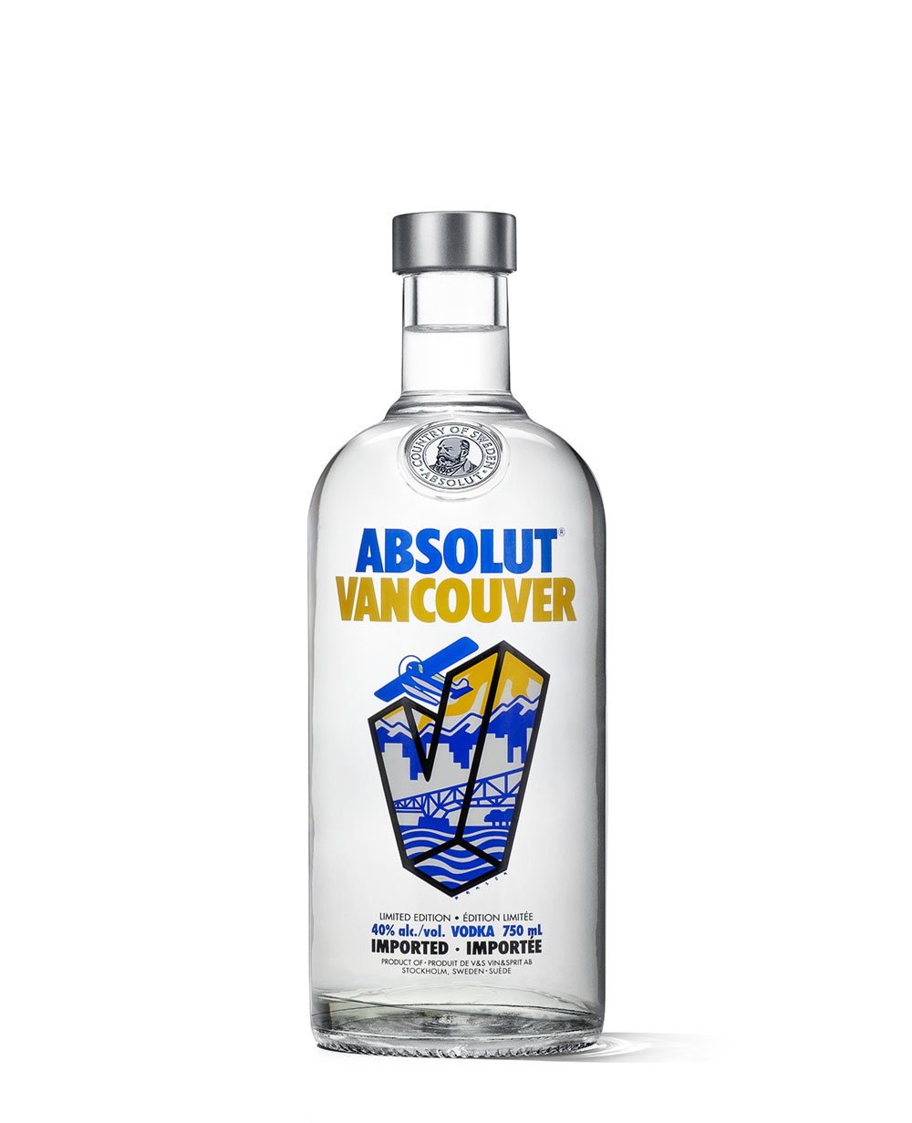
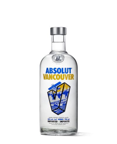
The first Canadian city bottle, drawn by the Victoria-based illustrator Douglas Fraser after a competition. An aeroplane passes over a stylised V filled with Vancouver — snow-capped mountains, driftwood and steel, towers and small neighbourhoods — in blue and orange. 60,000 copies.
Open the edition › -
Edition 2 of 18
Rio
2011 · 1 variant
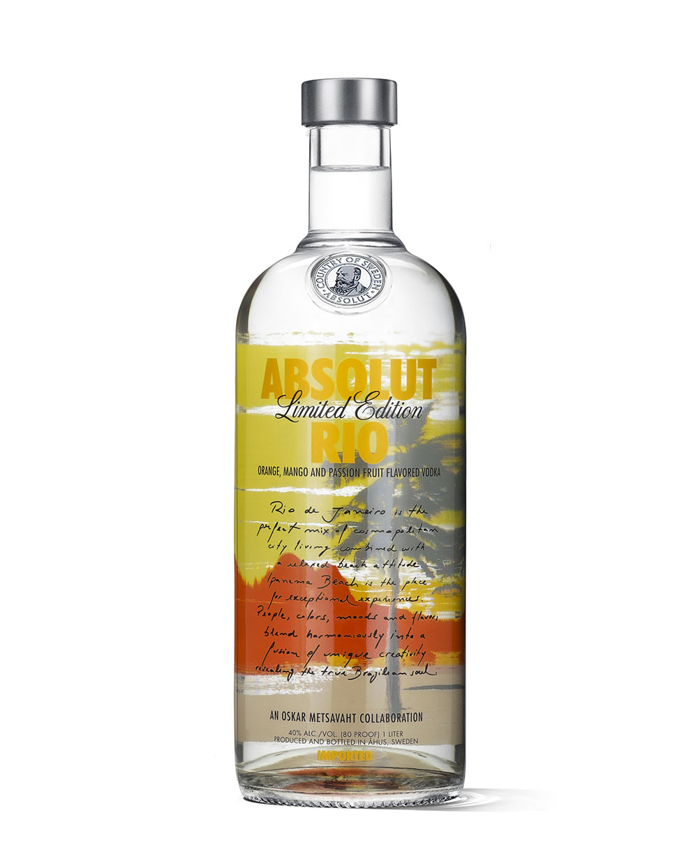
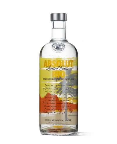
The first Absolut limited edition given to a Latin American country. Oskar Metsavaht, the designer behind Osklen, drew the bottle from his own photographs of Ipanema — the view towards Dois Irmãos on a late afternoon, at the hour Rio applauds the sunset — and helped choose the flavour to match: orange, mango and passion fruit.
Open the edition › -
Edition 3 of 18
Svea
2011 · 2 variants
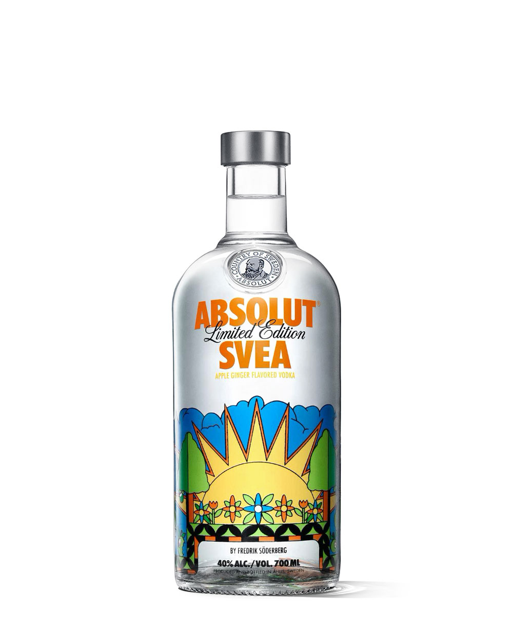
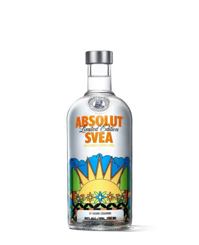
Made for Sweden, and named for it: Svea comes from Svea rike, the older name of the kingdom, and Moder Svea is the country's own personification. Fredrik Söderberg's brief was to interpret the Swedish character, and he settled on the swing between seasons — front and back carry the summer and winter solstice, with a story running spring to winter around the glass, framed by the Midgard Serpent as the old sagas frame theirs. The flavour follows the same logic: apple for Swedish late summer, ginger for the dark of the year, acidity meeting warmth.
Open the edition › -
Edition 4 of 18
Istanbul
2012 · 1 variant
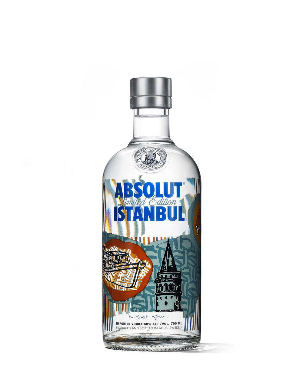
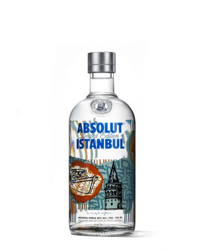
Yigit Yazici's Istanbul, signed by the artist, and shaped by the Expressionism, Pop Art and CoBRA that he names as his influences. The front carries the Galata Tower and a boat in black; a Macun trolley and a fish run down the side; on the back the striped ground is torn open by the Bosphorus, left white.
Open the edition › -
Edition 5 of 18
London
2012 · 1 variant
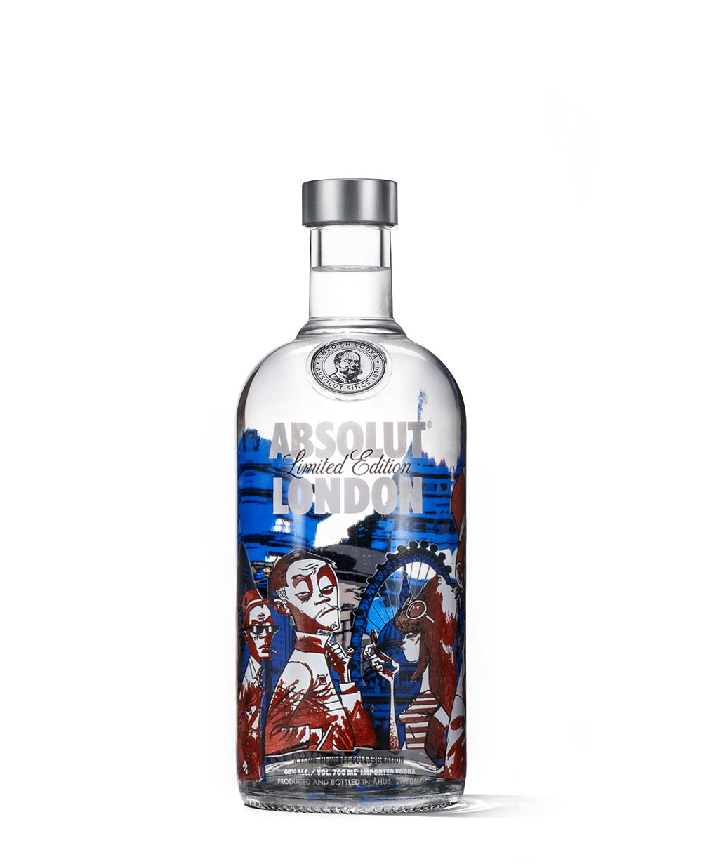
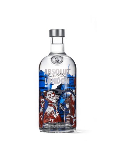
The first of the European city bottles, drawn by Jamie Hewlett — the artist behind Gorillaz and Tank Girl. Seven figures stand against the skyline, each one a style that shaped the city over two centuries: an eighteenth-century dandy, a Dickensian, a pinstriped gent, a sixties dollybird, a ska, a punk and an eighties casual, all in Hewlett's own line. 518,000 copies.
Open the edition › -
Edition 6 of 18
Mexico
2012 · 2 variants
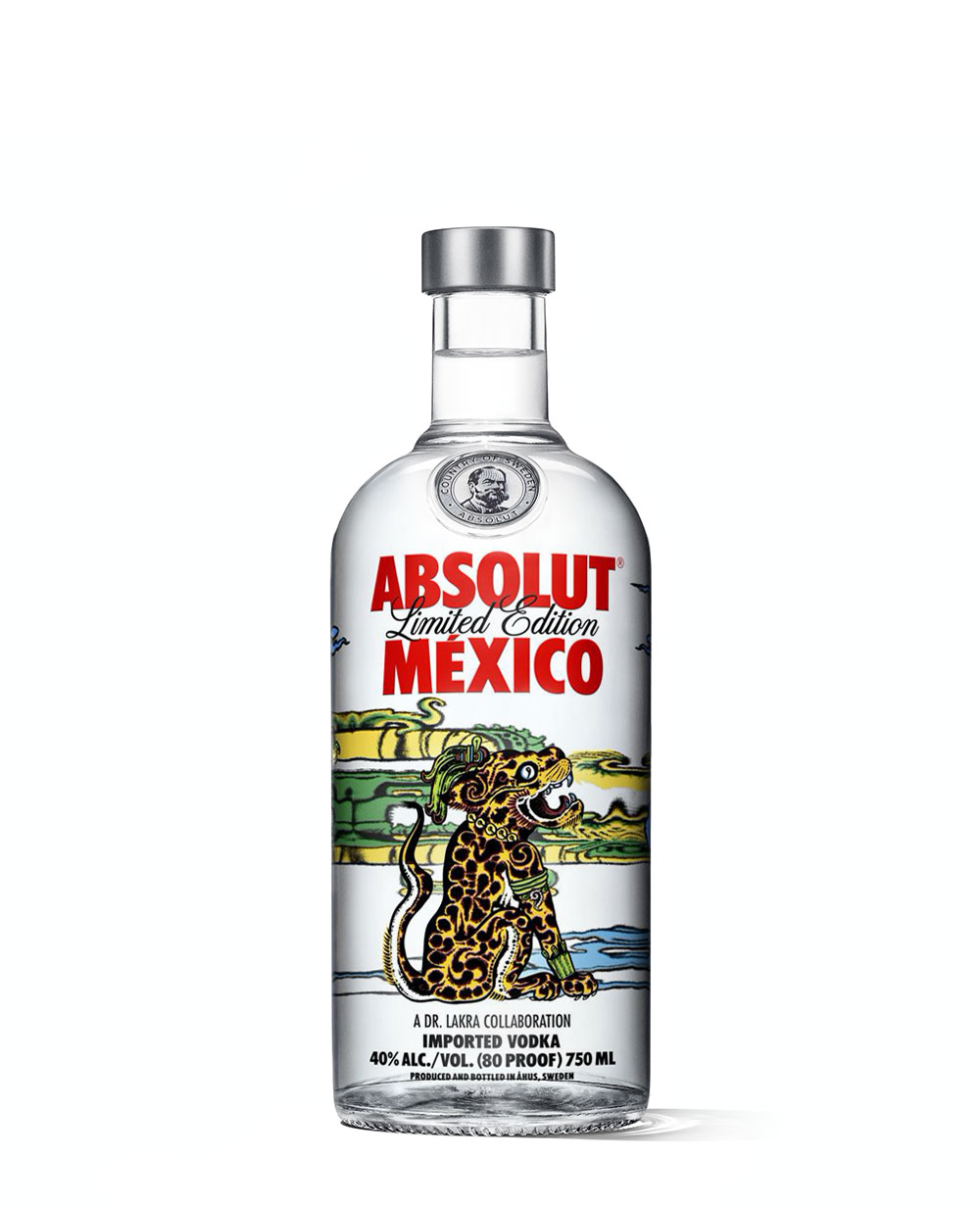
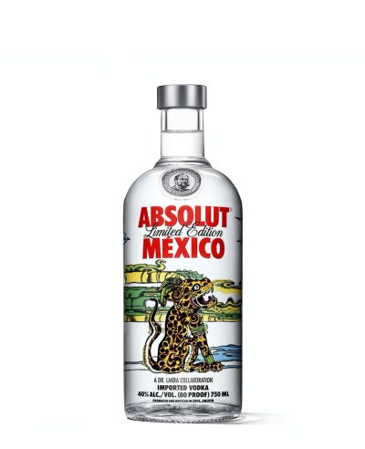
Dr. Lakra — the contemporary artist and tattooist Jerónimo López Ramírez — built this from three figures out of Mayan myth: Hurakan the hurricane, Kukulkan the serpent, Balam the jaguar. Ancient iconography redrawn through a tattooist's hand, in oranges, greens, blues and yellows, and meant as much to be kept as drunk. 180,000 copies for Mexico, 55,000 for the United States.
Open the edition › -
Edition 7 of 18
Polakom
2012 · 1 variant
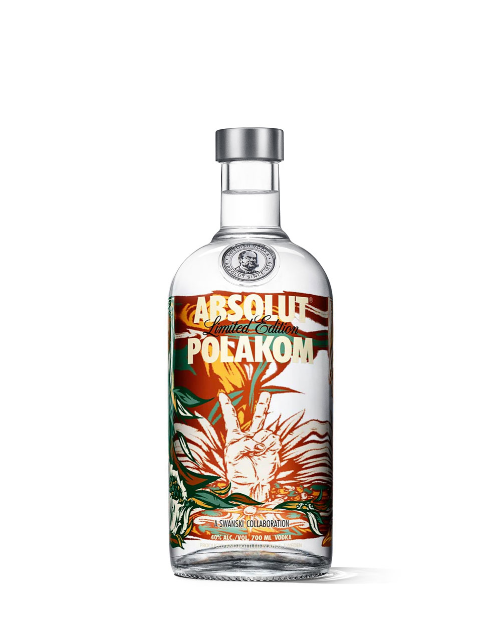
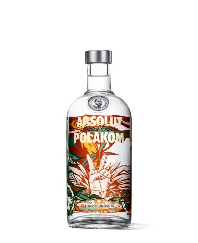
Polakom means for the Poles, and the bottle was sold nowhere else. Swanski, one of the country's most visible contemporary artists, put a stylised V at the centre — the victory sign, which in Poland reads as freedom and independence — inside a transparent wraparound floral in warm contrasting colours. He described it as street art crossed with an international retro feel: something like a poster on a Warsaw wall, for a rally or a club night. 200,000 copies.
Open the edition › -
Edition 8 of 18
Moscow
2013 · 1 variant
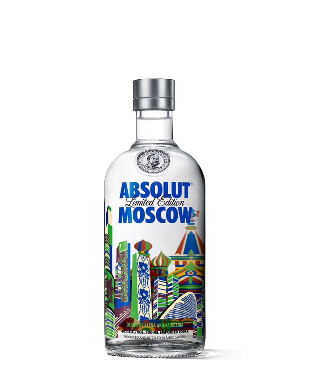
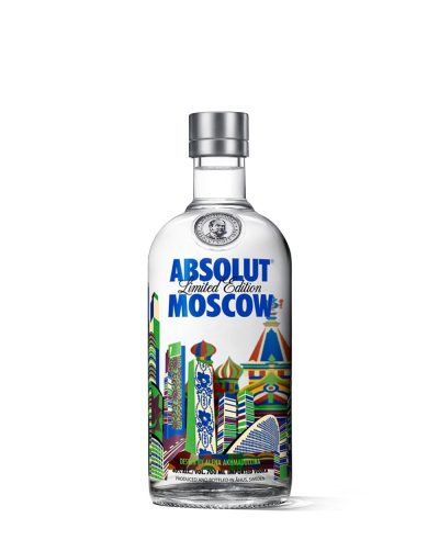
The Russian fashion designer Alena Akhmadullina drew Moscow as two cities at once — the traditional architecture and the glass towers going up beside it — in colourful patterning across the glass. Cocoon Group worked with her and Pernod Ricard on the project from the choice of artist through to the printed bottle. 150,000 copies.
Open the edition › -
Edition 9 of 18
Berlin
2014 · 1 variant
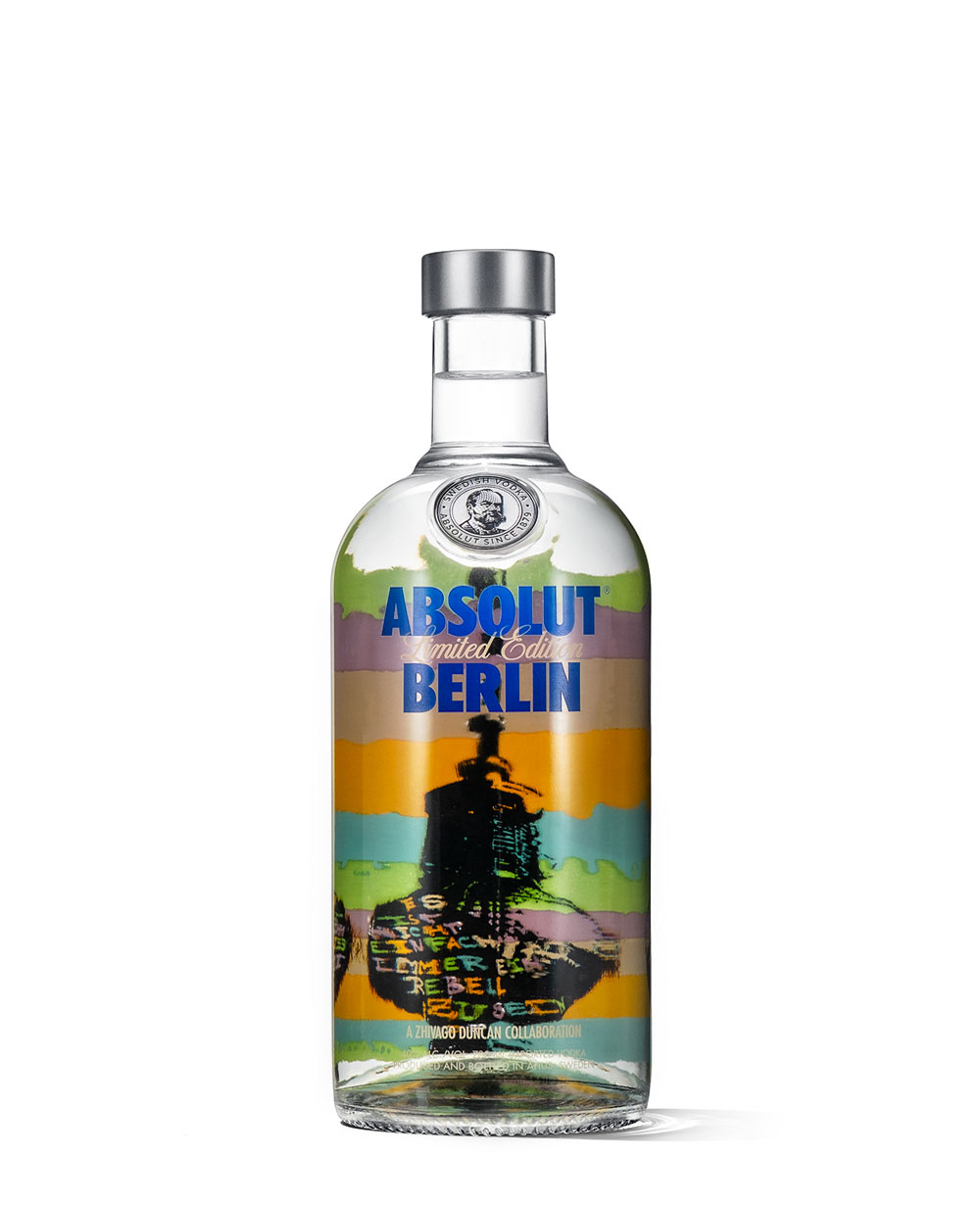
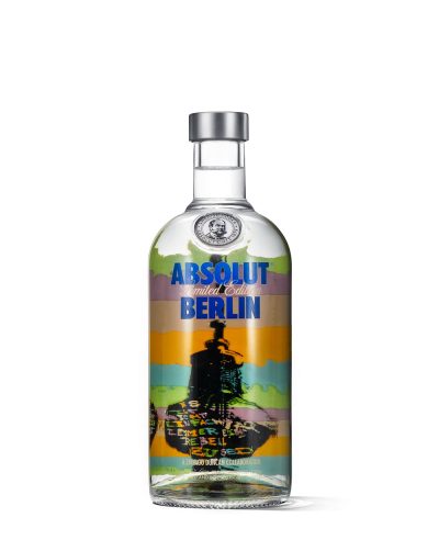
Berlin-based artist Zhivago Duncan put the Fernsehturm at the centre of this bottle — the tower that once broadcast a divided city's official line and now stands over one defined by artistic freedom. He imagined its sphere tagged with a line of graffiti: “Es ist nicht einfach immer ein Rebell zu sein”, it's not easy to always be a rebel. The palette is his own Berlin — grey for the old concrete, green for the urban forest, turquoise for oxidised statuary, cadmium yellow for the golden brick of a summer sunset, pink for the sunrise after a long night out. 300,000 copies, for Germany, Austria and Switzerland.
Open the edition › -
Edition 10 of 18
Oz
2014 · 2 variants
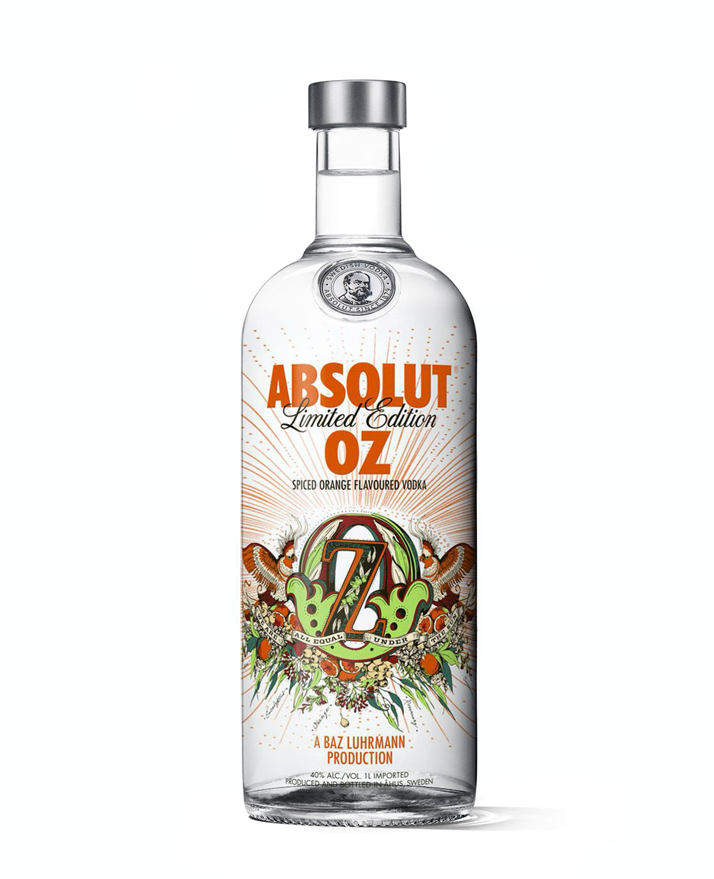
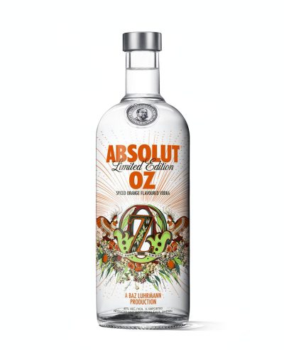
A spiced orange flavour made for Australia with Baz Luhrmann, one of the country's most recognisable creative figures outside music.
Open the edition › -
Edition 11 of 18
India #1
2015 · 2 variants
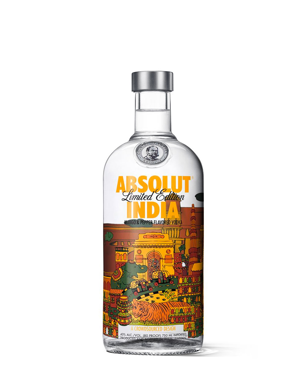
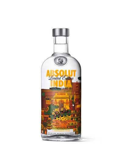
The first India bottle, with artwork by Shaheen Baig of Mumbai, drawing on eighteenth-century Indian decorative art for what she called a colourful cocktail of a country. The flavour matches it: mango against pepper, mellow with the spice held in balance. 84,000 in 750 ml and 38,400 in the litre.
Open the edition › -
Edition 12 of 18
Buenos Aires
2016 · 1 variant
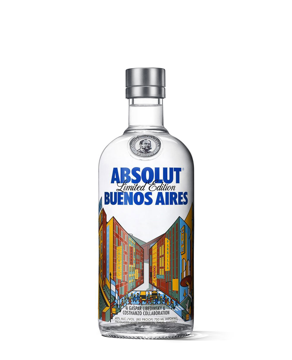
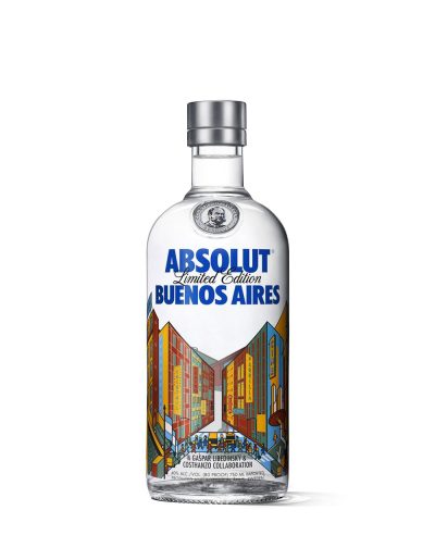
Old and new, wide avenues and narrow lanes, the popular and the elitist: Buenos Aires holds all of it at once, and Gaspar Libedinsky and Costhanzo took the Obelisk — the city's meeting point and silent witness — as the way to say so. The bottle stands in for the monument, and the illustration is the view out from it. 75,000 copies, for Argentina.
Open the edition › -
Edition 13 of 18
Korea
2016 · 1 variant
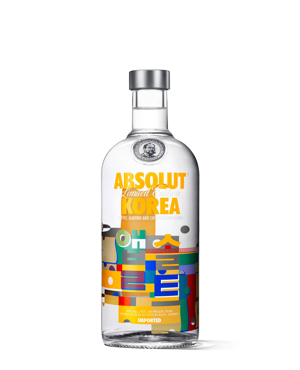
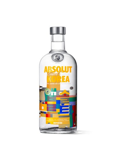
Coffee, almond and chilli, under a design by the contemporary Korean artist Heo Wook. He took the structural shapes of traditional architecture and rebuilt them as Hangul letters, each consonant and vowel interlocking like puzzle pieces to spell Absolut. The palette is the five obang colours — blue, red, yellow, white and black — with yellow, the colour of centre, brightness and hope, given the most room. 186,000 copies.
Open the edition › -
Edition 14 of 18
Canada
2017 · 1 variant
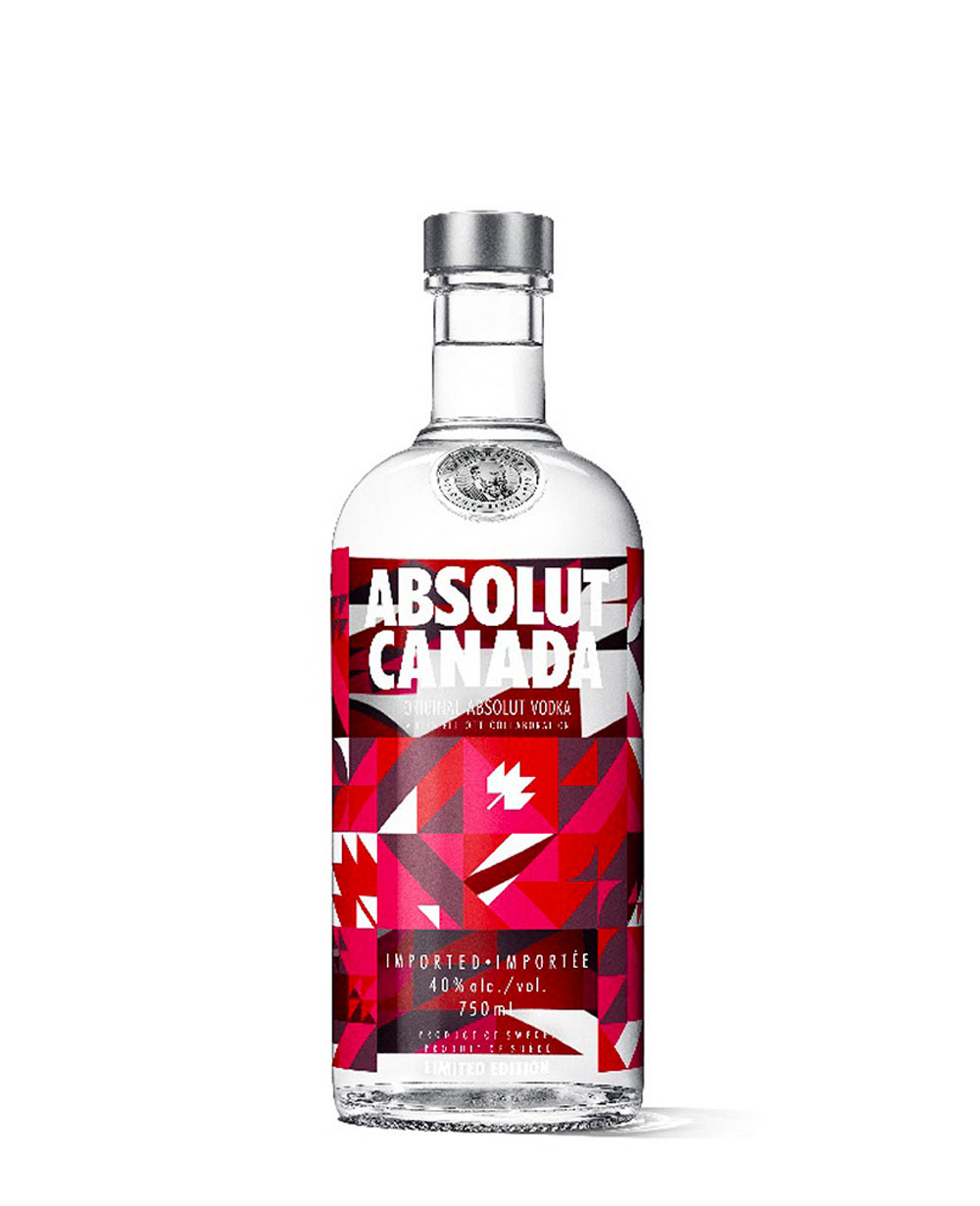
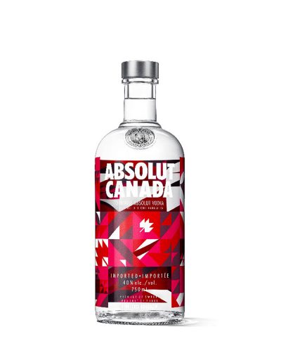
Made for the 150th anniversary of Confederation with the Canadian textile artist Elizabeth (Libs) Elliott, who designs quilt patterns with custom software and cuts her futuristic home textiles by laser — an old craft rebuilt with new tools, which is roughly the point. The bottle takes the traditional Maple Leaf quilt block on a modernised palette: geometric blocks for the country's diversity, a grid for its distances. 60,000 copies.
Open the edition › -
Edition 15 of 18
India #2
2018 · 2 variants
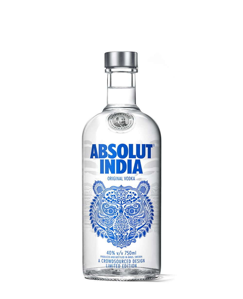
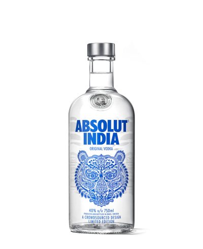
The second India bottle assembles the country from its emblems — a tiger, an elephant, peacocks, a banyan tree. 66,000 in 750 ml and 36,000 in the litre.
Open the edition › -
Edition 16 of 18
Åhus
2018 · 1 variant
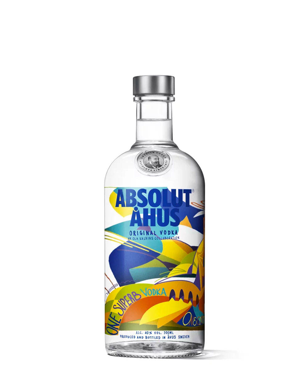
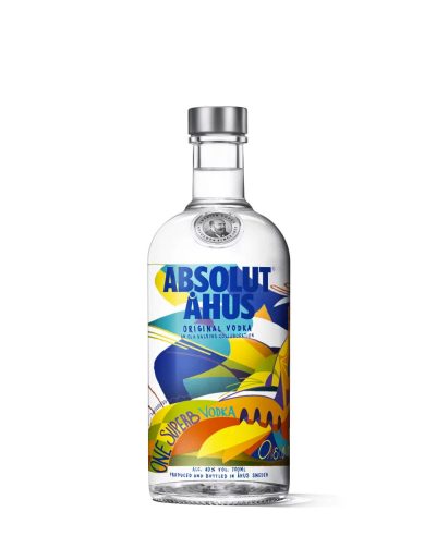
Released for the opening of Absolut Home, the brand's visitor centre in Åhus. The Swedish artist Ola Kalnins designed a bottle about place and continuity — the legacy of the distillery and the sustainable production that has become part of how Absolut presents itself.
Open the edition › -
Edition 17 of 18
Puerto Rico
2020 · 1 variant
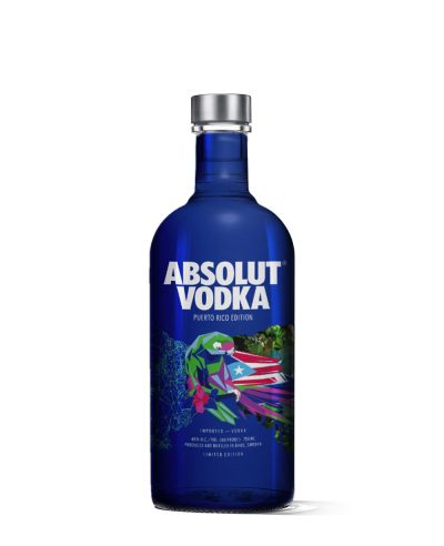
A foiled bottle for Puerto Rico: a tropical parrot in the colours of the island's flag. 55,000 copies.
Open the edition › -
Edition 18 of 18
India #3
2023 · 1 variant
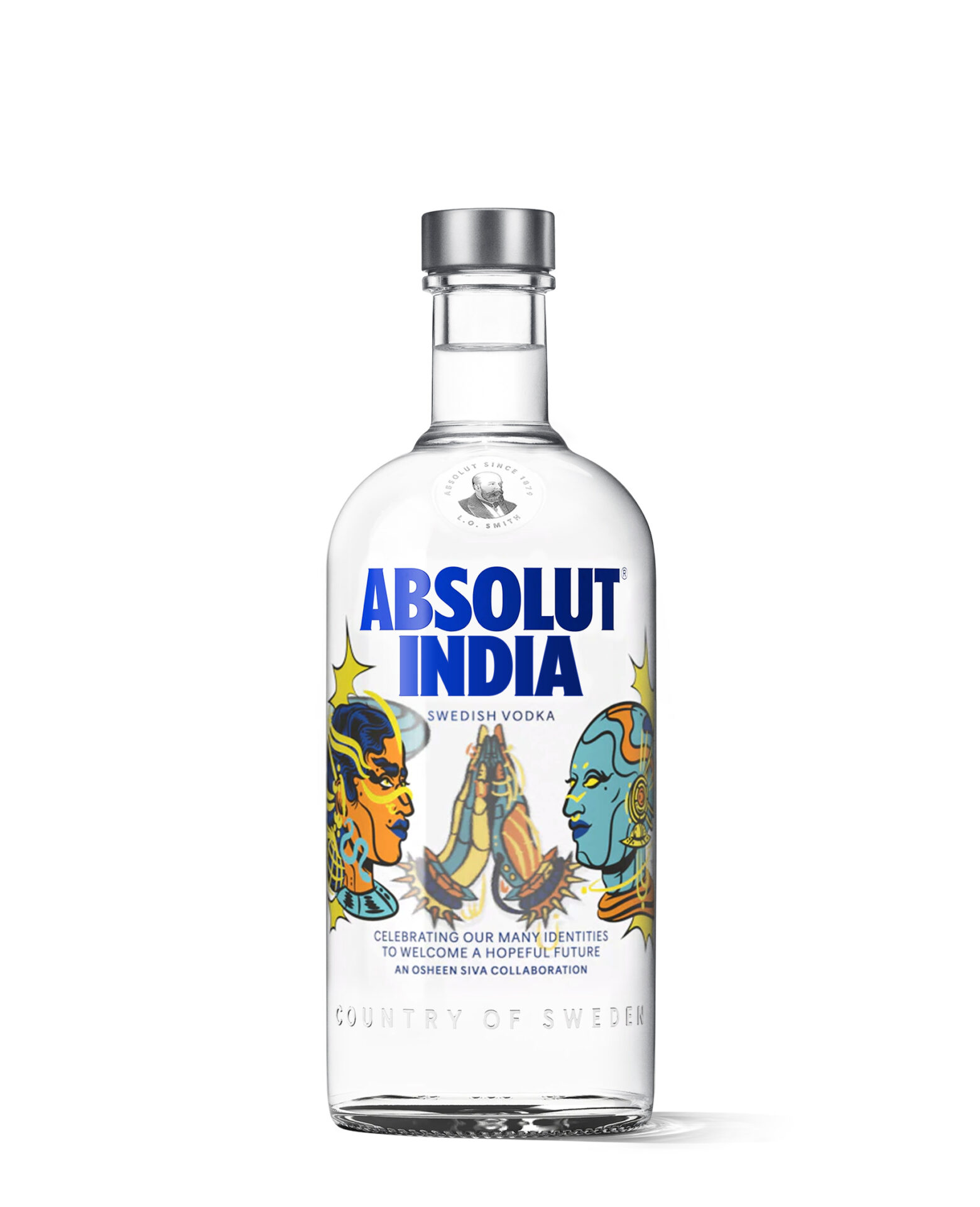
The third India bottle, by Osheen Siva, an artist from Thiruvannamalai, built around freedom. 180,000 copies.
Open the edition ›

 India #3
2023 · 1 variant
The third India bottle, by Osheen Siva, an artist from Thiruvannamalai, built around freedom. 180,000 copies.
India #3
2023 · 1 variant
The third India bottle, by Osheen Siva, an artist from Thiruvannamalai, built around freedom. 180,000 copies.
 Puerto Rico
2020 · 1 variant
A foiled bottle for Puerto Rico: a tropical parrot in the colours of the island's flag. 55,000 copies.
Puerto Rico
2020 · 1 variant
A foiled bottle for Puerto Rico: a tropical parrot in the colours of the island's flag. 55,000 copies.
 India #2
2018 · 2 variants
The second India bottle assembles the country from its emblems — a tiger, an elephant, peacocks, a banyan tree. 66,000 in 750 ml and 36,000 in the litre.
India #2
2018 · 2 variants
The second India bottle assembles the country from its emblems — a tiger, an elephant, peacocks, a banyan tree. 66,000 in 750 ml and 36,000 in the litre.
 Åhus
2018 · 1 variant
Released for the opening of Absolut Home, the brand's visitor centre in Åhus. The Swedish artist Ola Kalnins designed a bottle about place and continuity — the legacy of the distillery and the sustainable production that has become part of how Absolut presents itself.
Åhus
2018 · 1 variant
Released for the opening of Absolut Home, the brand's visitor centre in Åhus. The Swedish artist Ola Kalnins designed a bottle about place and continuity — the legacy of the distillery and the sustainable production that has become part of how Absolut presents itself.
 Canada
2017 · 1 variant
Made for the 150th anniversary of Confederation with the Canadian textile artist Elizabeth (Libs) Elliott, who designs quilt patterns with custom software and cuts her futuristic home textiles by laser — an old craft rebuilt with new tools, which is roughly the point. The bottle takes the traditional Maple Leaf quilt block on a modernised palette: geometric blocks for the country's diversity, a grid for its distances. 60,000 copies.
Canada
2017 · 1 variant
Made for the 150th anniversary of Confederation with the Canadian textile artist Elizabeth (Libs) Elliott, who designs quilt patterns with custom software and cuts her futuristic home textiles by laser — an old craft rebuilt with new tools, which is roughly the point. The bottle takes the traditional Maple Leaf quilt block on a modernised palette: geometric blocks for the country's diversity, a grid for its distances. 60,000 copies.
 Buenos Aires
2016 · 1 variant
Old and new, wide avenues and narrow lanes, the popular and the elitist: Buenos Aires holds all of it at once, and Gaspar Libedinsky and Costhanzo took the Obelisk — the city's meeting point and silent witness — as the way to say so. The bottle stands in for the monument, and the illustration is the view out from it. 75,000 copies, for Argentina.
Buenos Aires
2016 · 1 variant
Old and new, wide avenues and narrow lanes, the popular and the elitist: Buenos Aires holds all of it at once, and Gaspar Libedinsky and Costhanzo took the Obelisk — the city's meeting point and silent witness — as the way to say so. The bottle stands in for the monument, and the illustration is the view out from it. 75,000 copies, for Argentina.
 Korea
2016 · 1 variant
Coffee, almond and chilli, under a design by the contemporary Korean artist Heo Wook. He took the structural shapes of traditional architecture and rebuilt them as Hangul letters, each consonant and vowel interlocking like puzzle pieces to spell Absolut. The palette is the five obang colours — blue, red, yellow, white and black — with yellow, the colour of centre, brightness and hope, given the most room. 186,000 copies.
Korea
2016 · 1 variant
Coffee, almond and chilli, under a design by the contemporary Korean artist Heo Wook. He took the structural shapes of traditional architecture and rebuilt them as Hangul letters, each consonant and vowel interlocking like puzzle pieces to spell Absolut. The palette is the five obang colours — blue, red, yellow, white and black — with yellow, the colour of centre, brightness and hope, given the most room. 186,000 copies.
 India #1
2015 · 2 variants
The first India bottle, with artwork by Shaheen Baig of Mumbai, drawing on eighteenth-century Indian decorative art for what she called a colourful cocktail of a country. The flavour matches it: mango against pepper, mellow with the spice held in balance. 84,000 in 750 ml and 38,400 in the litre.
India #1
2015 · 2 variants
The first India bottle, with artwork by Shaheen Baig of Mumbai, drawing on eighteenth-century Indian decorative art for what she called a colourful cocktail of a country. The flavour matches it: mango against pepper, mellow with the spice held in balance. 84,000 in 750 ml and 38,400 in the litre.
 Berlin
2014 · 1 variant
Berlin-based artist Zhivago Duncan put the Fernsehturm at the centre of this bottle — the tower that once broadcast a divided city's official line and now stands over one defined by artistic freedom. He imagined its sphere tagged with a line of graffiti: “Es ist nicht einfach immer ein Rebell zu sein”, it's not easy to always be a rebel. The palette is his own Berlin — grey for the old concrete, green for the urban forest, turquoise for oxidised statuary, cadmium yellow for the golden brick of a summer sunset, pink for the sunrise after a long night out. 300,000 copies, for Germany, Austria and Switzerland.
Berlin
2014 · 1 variant
Berlin-based artist Zhivago Duncan put the Fernsehturm at the centre of this bottle — the tower that once broadcast a divided city's official line and now stands over one defined by artistic freedom. He imagined its sphere tagged with a line of graffiti: “Es ist nicht einfach immer ein Rebell zu sein”, it's not easy to always be a rebel. The palette is his own Berlin — grey for the old concrete, green for the urban forest, turquoise for oxidised statuary, cadmium yellow for the golden brick of a summer sunset, pink for the sunrise after a long night out. 300,000 copies, for Germany, Austria and Switzerland.
 Oz
2014 · 2 variants
A spiced orange flavour made for Australia with Baz Luhrmann, one of the country's most recognisable creative figures outside music.
Oz
2014 · 2 variants
A spiced orange flavour made for Australia with Baz Luhrmann, one of the country's most recognisable creative figures outside music.
 Moscow
2013 · 1 variant
The Russian fashion designer Alena Akhmadullina drew Moscow as two cities at once — the traditional architecture and the glass towers going up beside it — in colourful patterning across the glass. Cocoon Group worked with her and Pernod Ricard on the project from the choice of artist through to the printed bottle. 150,000 copies.
Moscow
2013 · 1 variant
The Russian fashion designer Alena Akhmadullina drew Moscow as two cities at once — the traditional architecture and the glass towers going up beside it — in colourful patterning across the glass. Cocoon Group worked with her and Pernod Ricard on the project from the choice of artist through to the printed bottle. 150,000 copies.
 Istanbul
2012 · 1 variant
Yigit Yazici's Istanbul, signed by the artist, and shaped by the Expressionism, Pop Art and CoBRA that he names as his influences. The front carries the Galata Tower and a boat in black; a Macun trolley and a fish run down the side; on the back the striped ground is torn open by the Bosphorus, left white.
Istanbul
2012 · 1 variant
Yigit Yazici's Istanbul, signed by the artist, and shaped by the Expressionism, Pop Art and CoBRA that he names as his influences. The front carries the Galata Tower and a boat in black; a Macun trolley and a fish run down the side; on the back the striped ground is torn open by the Bosphorus, left white.
 London
2012 · 1 variant
The first of the European city bottles, drawn by Jamie Hewlett — the artist behind Gorillaz and Tank Girl. Seven figures stand against the skyline, each one a style that shaped the city over two centuries: an eighteenth-century dandy, a Dickensian, a pinstriped gent, a sixties dollybird, a ska, a punk and an eighties casual, all in Hewlett's own line. 518,000 copies.
London
2012 · 1 variant
The first of the European city bottles, drawn by Jamie Hewlett — the artist behind Gorillaz and Tank Girl. Seven figures stand against the skyline, each one a style that shaped the city over two centuries: an eighteenth-century dandy, a Dickensian, a pinstriped gent, a sixties dollybird, a ska, a punk and an eighties casual, all in Hewlett's own line. 518,000 copies.
 Mexico
2012 · 2 variants
Dr. Lakra — the contemporary artist and tattooist Jerónimo López Ramírez — built this from three figures out of Mayan myth: Hurakan the hurricane, Kukulkan the serpent, Balam the jaguar. Ancient iconography redrawn through a tattooist's hand, in oranges, greens, blues and yellows, and meant as much to be kept as drunk. 180,000 copies for Mexico, 55,000 for the United States.
Mexico
2012 · 2 variants
Dr. Lakra — the contemporary artist and tattooist Jerónimo López Ramírez — built this from three figures out of Mayan myth: Hurakan the hurricane, Kukulkan the serpent, Balam the jaguar. Ancient iconography redrawn through a tattooist's hand, in oranges, greens, blues and yellows, and meant as much to be kept as drunk. 180,000 copies for Mexico, 55,000 for the United States.
 Polakom
2012 · 1 variant
Polakom means for the Poles, and the bottle was sold nowhere else. Swanski, one of the country's most visible contemporary artists, put a stylised V at the centre — the victory sign, which in Poland reads as freedom and independence — inside a transparent wraparound floral in warm contrasting colours. He described it as street art crossed with an international retro feel: something like a poster on a Warsaw wall, for a rally or a club night. 200,000 copies.
Polakom
2012 · 1 variant
Polakom means for the Poles, and the bottle was sold nowhere else. Swanski, one of the country's most visible contemporary artists, put a stylised V at the centre — the victory sign, which in Poland reads as freedom and independence — inside a transparent wraparound floral in warm contrasting colours. He described it as street art crossed with an international retro feel: something like a poster on a Warsaw wall, for a rally or a club night. 200,000 copies.
 Rio
2011 · 1 variant
The first Absolut limited edition given to a Latin American country. Oskar Metsavaht, the designer behind Osklen, drew the bottle from his own photographs of Ipanema — the view towards Dois Irmãos on a late afternoon, at the hour Rio applauds the sunset — and helped choose the flavour to match: orange, mango and passion fruit.
Rio
2011 · 1 variant
The first Absolut limited edition given to a Latin American country. Oskar Metsavaht, the designer behind Osklen, drew the bottle from his own photographs of Ipanema — the view towards Dois Irmãos on a late afternoon, at the hour Rio applauds the sunset — and helped choose the flavour to match: orange, mango and passion fruit.
 Svea
2011 · 2 variants
Made for Sweden, and named for it: Svea comes from Svea rike, the older name of the kingdom, and Moder Svea is the country's own personification. Fredrik Söderberg's brief was to interpret the Swedish character, and he settled on the swing between seasons — front and back carry the summer and winter solstice, with a story running spring to winter around the glass, framed by the Midgard Serpent as the old sagas frame theirs. The flavour follows the same logic: apple for Swedish late summer, ginger for the dark of the year, acidity meeting warmth.
Svea
2011 · 2 variants
Made for Sweden, and named for it: Svea comes from Svea rike, the older name of the kingdom, and Moder Svea is the country's own personification. Fredrik Söderberg's brief was to interpret the Swedish character, and he settled on the swing between seasons — front and back carry the summer and winter solstice, with a story running spring to winter around the glass, framed by the Midgard Serpent as the old sagas frame theirs. The flavour follows the same logic: apple for Swedish late summer, ginger for the dark of the year, acidity meeting warmth.
 Vancouver
2010 · 1 variant
The first Canadian city bottle, drawn by the Victoria-based illustrator Douglas Fraser after a competition. An aeroplane passes over a stylised V filled with Vancouver — snow-capped mountains, driftwood and steel, towers and small neighbourhoods — in blue and orange. 60,000 copies.
Vancouver
2010 · 1 variant
The first Canadian city bottle, drawn by the Victoria-based illustrator Douglas Fraser after a competition. An aeroplane passes over a stylised V filled with Vancouver — snow-capped mountains, driftwood and steel, towers and small neighbourhoods — in blue and orange. 60,000 copies.
-
2023
India #3
1 variant
The third India bottle, by Osheen Siva, an artist from Thiruvannamalai, built around freedom. 180,000 copies.
-
2020
Puerto Rico
1 variant
A foiled bottle for Puerto Rico: a tropical parrot in the colours of the island's flag. 55,000 copies.
-
2018
India #2
2 variants
The second India bottle assembles the country from its emblems — a tiger, an elephant, peacocks, a banyan tree. 66,000 in 750 ml and 36,000 in the litre.
Åhus
1 variant
Released for the opening of Absolut Home, the brand's visitor centre in Åhus. The Swedish artist Ola Kalnins designed a bottle about place and continuity — the legacy of the distillery and the sustainable production that has become part of how Absolut presents itself.
-
2017
Canada
1 variant
Made for the 150th anniversary of Confederation with the Canadian textile artist Elizabeth (Libs) Elliott, who designs quilt patterns with custom software and cuts her futuristic home textiles by laser — an old craft rebuilt with new tools, which is roughly the point. The bottle takes the traditional Maple Leaf quilt block on a modernised palette: geometric blocks for the country's diversity, a grid for its distances. 60,000 copies.
-
2016
Buenos Aires
1 variant
Old and new, wide avenues and narrow lanes, the popular and the elitist: Buenos Aires holds all of it at once, and Gaspar Libedinsky and Costhanzo took the Obelisk — the city's meeting point and silent witness — as the way to say so. The bottle stands in for the monument, and the illustration is the view out from it. 75,000 copies, for Argentina.
Korea
1 variant
Coffee, almond and chilli, under a design by the contemporary Korean artist Heo Wook. He took the structural shapes of traditional architecture and rebuilt them as Hangul letters, each consonant and vowel interlocking like puzzle pieces to spell Absolut. The palette is the five obang colours — blue, red, yellow, white and black — with yellow, the colour of centre, brightness and hope, given the most room. 186,000 copies.
-
2015
India #1
2 variants
The first India bottle, with artwork by Shaheen Baig of Mumbai, drawing on eighteenth-century Indian decorative art for what she called a colourful cocktail of a country. The flavour matches it: mango against pepper, mellow with the spice held in balance. 84,000 in 750 ml and 38,400 in the litre.
-
2014
Berlin
1 variant
Berlin-based artist Zhivago Duncan put the Fernsehturm at the centre of this bottle — the tower that once broadcast a divided city's official line and now stands over one defined by artistic freedom. He imagined its sphere tagged with a line of graffiti: “Es ist nicht einfach immer ein Rebell zu sein”, it's not easy to always be a rebel. The palette is his own Berlin — grey for the old concrete, green for the urban forest, turquoise for oxidised statuary, cadmium yellow for the golden brick of a summer sunset, pink for the sunrise after a long night out. 300,000 copies, for Germany, Austria and Switzerland.
Oz
2 variants
A spiced orange flavour made for Australia with Baz Luhrmann, one of the country's most recognisable creative figures outside music.
-
2013
Moscow
1 variant
The Russian fashion designer Alena Akhmadullina drew Moscow as two cities at once — the traditional architecture and the glass towers going up beside it — in colourful patterning across the glass. Cocoon Group worked with her and Pernod Ricard on the project from the choice of artist through to the printed bottle. 150,000 copies.
-
2012
Istanbul
1 variant
Yigit Yazici's Istanbul, signed by the artist, and shaped by the Expressionism, Pop Art and CoBRA that he names as his influences. The front carries the Galata Tower and a boat in black; a Macun trolley and a fish run down the side; on the back the striped ground is torn open by the Bosphorus, left white.
London
1 variant
The first of the European city bottles, drawn by Jamie Hewlett — the artist behind Gorillaz and Tank Girl. Seven figures stand against the skyline, each one a style that shaped the city over two centuries: an eighteenth-century dandy, a Dickensian, a pinstriped gent, a sixties dollybird, a ska, a punk and an eighties casual, all in Hewlett's own line. 518,000 copies.
Mexico
2 variants
Dr. Lakra — the contemporary artist and tattooist Jerónimo López Ramírez — built this from three figures out of Mayan myth: Hurakan the hurricane, Kukulkan the serpent, Balam the jaguar. Ancient iconography redrawn through a tattooist's hand, in oranges, greens, blues and yellows, and meant as much to be kept as drunk. 180,000 copies for Mexico, 55,000 for the United States.
Polakom
1 variant
Polakom means for the Poles, and the bottle was sold nowhere else. Swanski, one of the country's most visible contemporary artists, put a stylised V at the centre — the victory sign, which in Poland reads as freedom and independence — inside a transparent wraparound floral in warm contrasting colours. He described it as street art crossed with an international retro feel: something like a poster on a Warsaw wall, for a rally or a club night. 200,000 copies.
-
2011
Rio
1 variant
The first Absolut limited edition given to a Latin American country. Oskar Metsavaht, the designer behind Osklen, drew the bottle from his own photographs of Ipanema — the view towards Dois Irmãos on a late afternoon, at the hour Rio applauds the sunset — and helped choose the flavour to match: orange, mango and passion fruit.
Svea
2 variants
Made for Sweden, and named for it: Svea comes from Svea rike, the older name of the kingdom, and Moder Svea is the country's own personification. Fredrik Söderberg's brief was to interpret the Swedish character, and he settled on the swing between seasons — front and back carry the summer and winter solstice, with a story running spring to winter around the glass, framed by the Midgard Serpent as the old sagas frame theirs. The flavour follows the same logic: apple for Swedish late summer, ginger for the dark of the year, acidity meeting warmth.
-
2010
Vancouver
1 variant
The first Canadian city bottle, drawn by the Victoria-based illustrator Douglas Fraser after a competition. An aeroplane passes over a stylised V filled with Vancouver — snow-capped mountains, driftwood and steel, towers and small neighbourhoods — in blue and orange. 60,000 copies.